Visual Identity for “The senior dog”.
“The senior dog” is a company focused on elderly dog care products, seeking to offer the best products available in the market for those targeted users.
Therefore, it places the users as a protagonist of their identity and seeks for a modern and friendly appearance, and at the same time to be solid and approachable.
The logotype is approachable and easy to read. Aspects such as the optical kerning or a refined weight for the text have been considered in order to make it easy to understand. Illustrations and icons are also very simple and minimalistic.
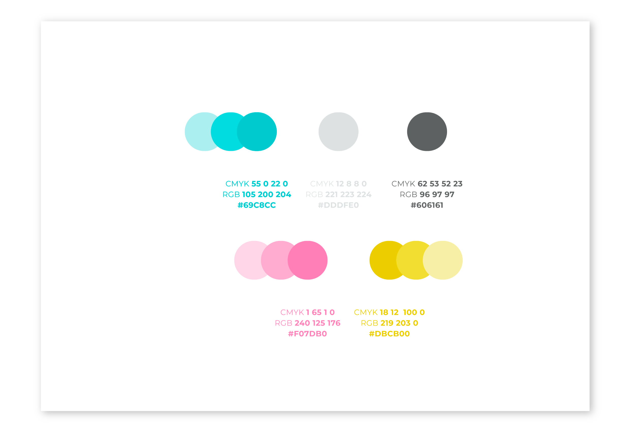
The palette of colors is simple and vivid. It consists in two primary colors, which are blue and pink and then three secondary colors, grey for text and lime for very specific details.


