RIU. Packaging Illustrations
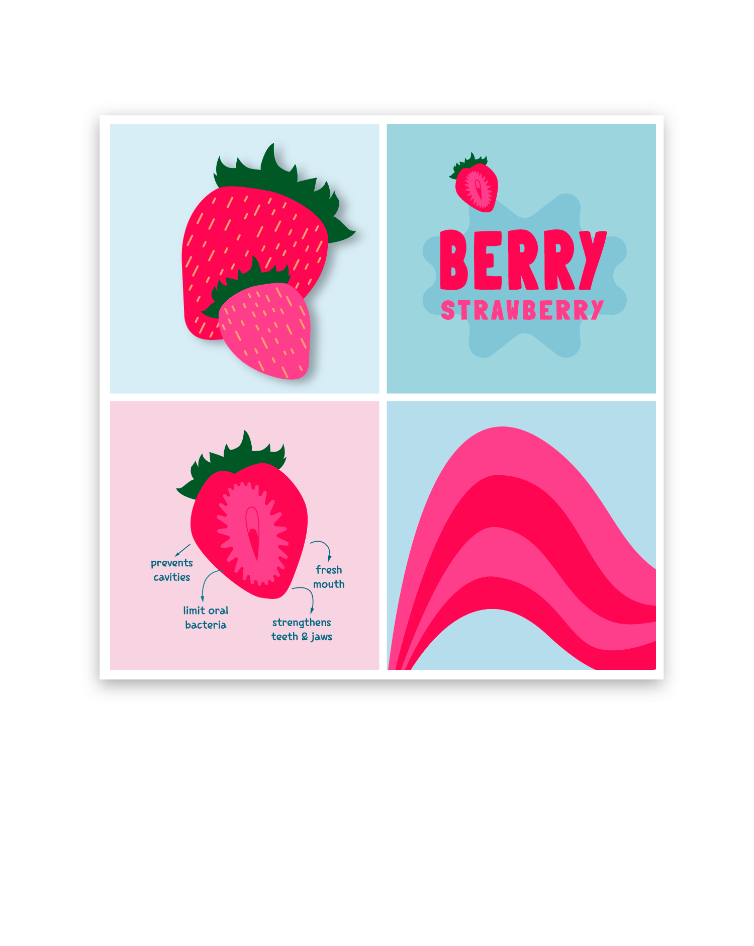
Plant-based toothpaste brand Riu, which means smile in Catalan and also river, commissioned to create a logo and packaging illustrations for their 2 new kids flavors:
Berry Strawberry
Minty Mint
They wanted some quirky illustrations, simple and colored, so that children could connect easily with the product and make the packaging become playful, friendly and positive.
The colors of the three different packaging are inspired by the colors found in children products. This makes the packaging feel nicely familiar with a twist.
The Riu logo is a curvy line with the colors of each toothpaste with white visible RIU word on top of it, symbolizing how whites and clean become the teeth after using RIU’s toothpaste


